Flourishing Lives
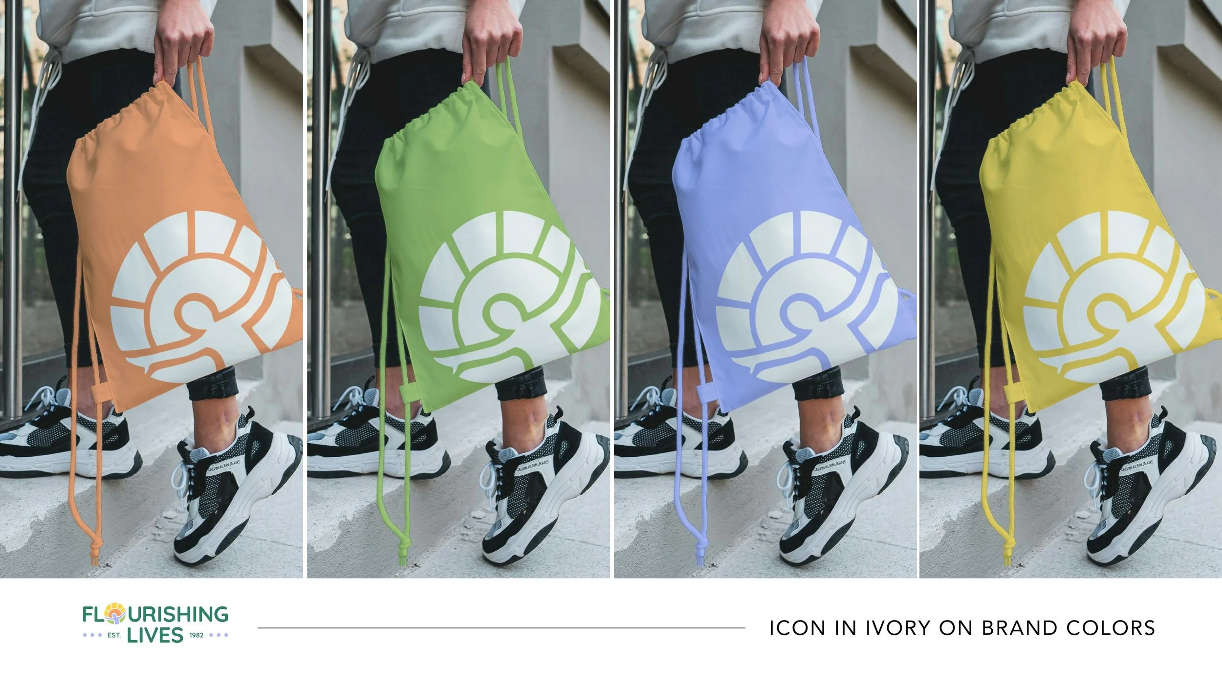
This rebrand captures the heart of Flourishing Lives: a place where children and families grow with confidence and care. The outstretched figure symbolizes joy and empowerment, reaching toward a rising sun of hope and new beginnings.
Warm, bright colors evoke calm and safety, while the circular form reflects unity and whole-family support. Clear, inviting typography ties it all together—professional, nurturing, and full of heart.
Flourishing Lives now looks the way it feels: supportive, hopeful, and ready to help families thrive.