Clarus Brand Evolution
Clarus Lighting + Controls is a lighting manufacturer representative agency for the South Eastern Michigan and Northern Ohio markets.
When researching these regions, we found that the lighting industry is missing two important components when it comes to branding - humanity & passion.
The warmth of Clarus’s employees and their commitment to excellence in every step of what can be a complicated process, is what makes Clarus different.
We have the opportunity to show the world the humanity and undeniable passion that Clarus encompasses. In doing this, we can stand out in a market that can be cold, impersonal and uninspiring.
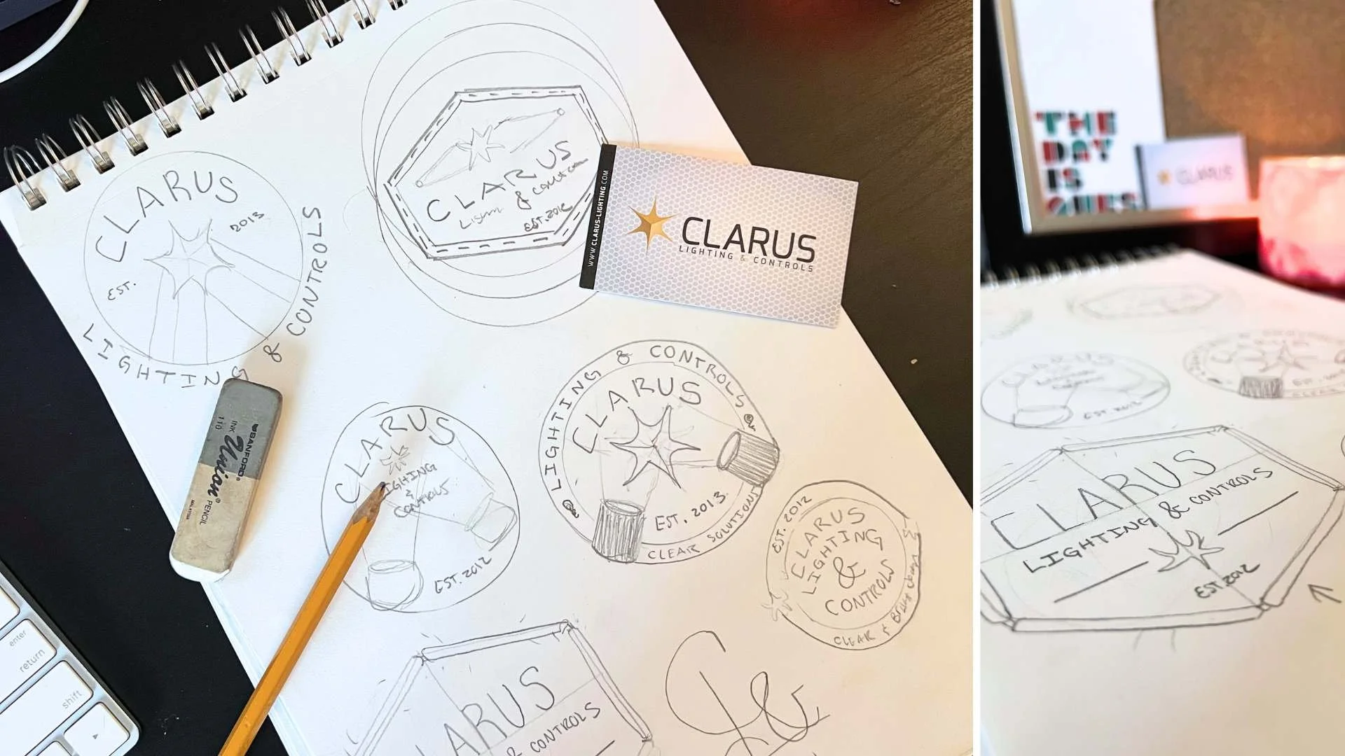
Let’s start with the logo redesign…
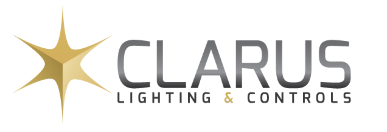
OLD LOGO
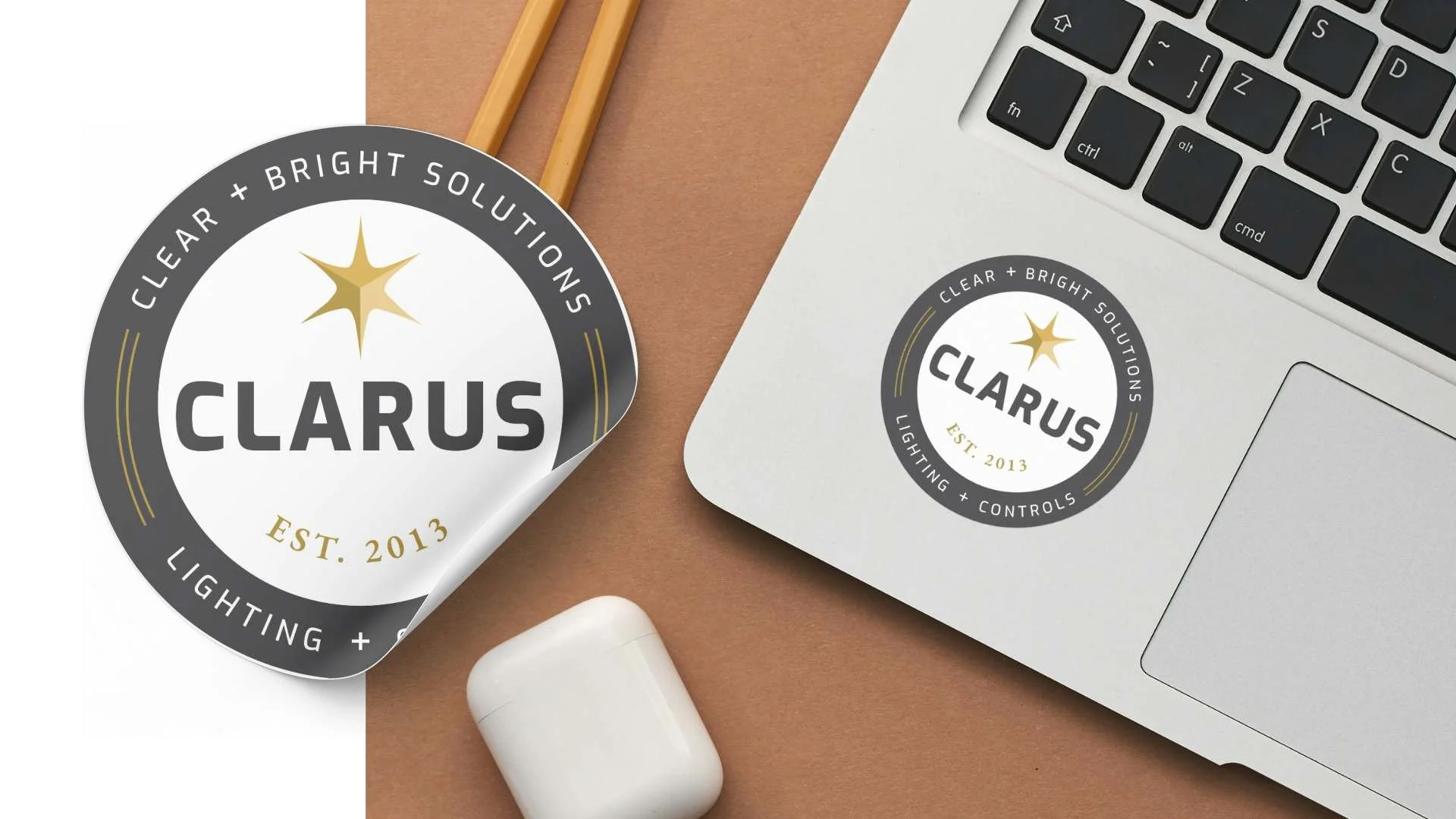
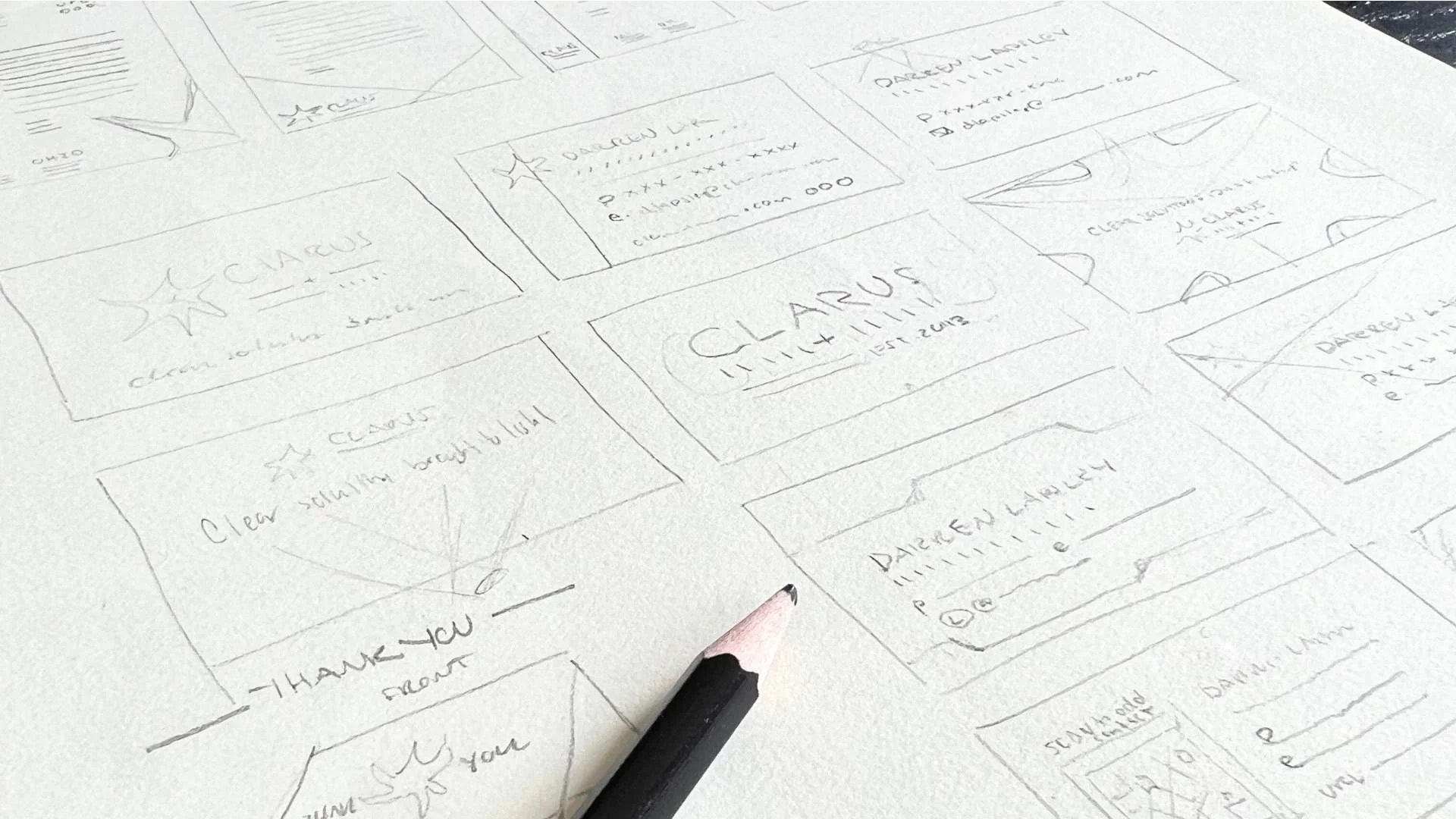
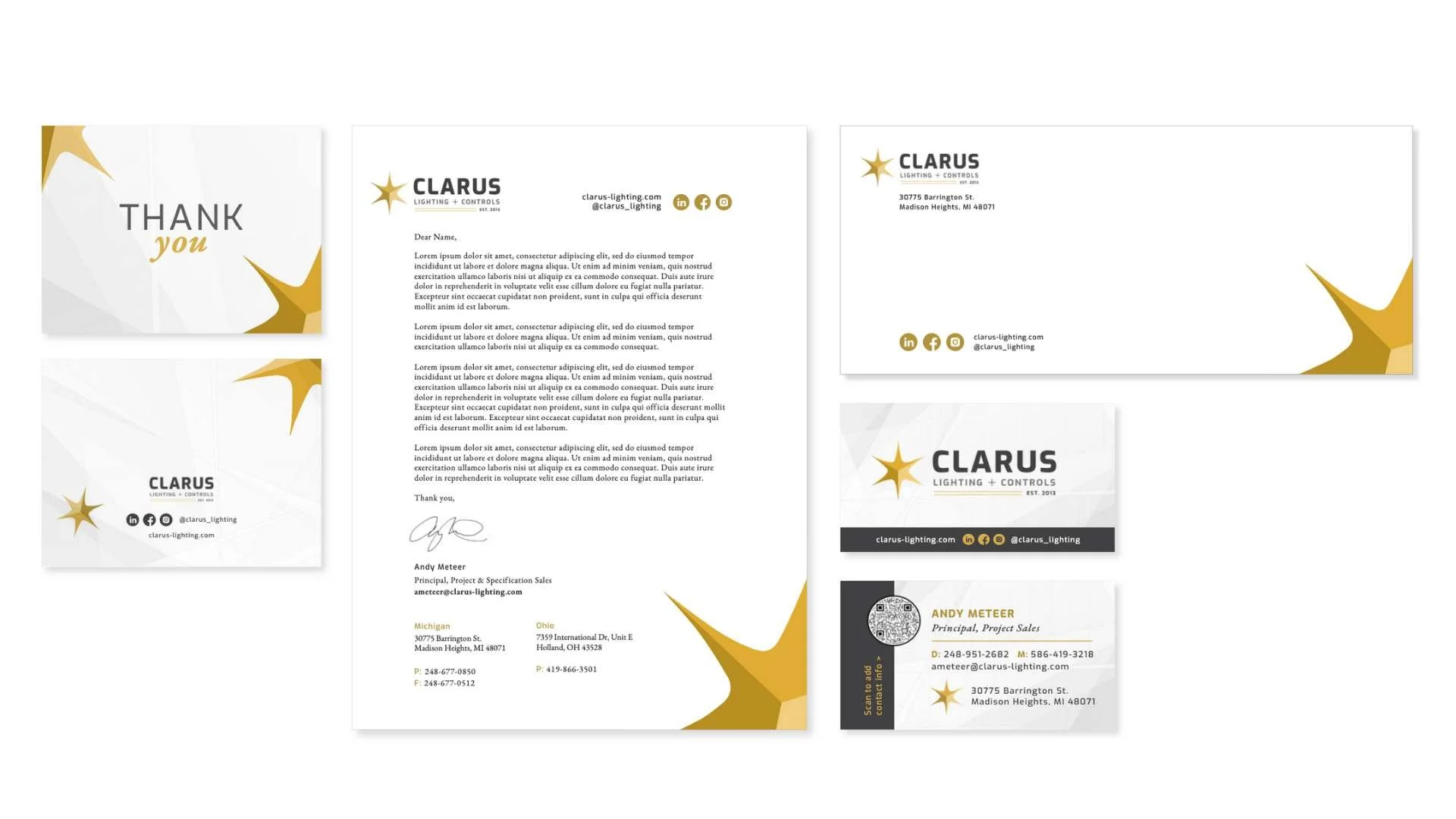
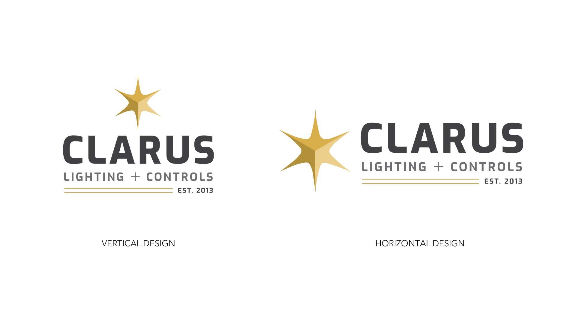
Logo Redesign Goals
Create visual authority within the Detroit and Ohio lighting market.
Convey authenticity and boldness.
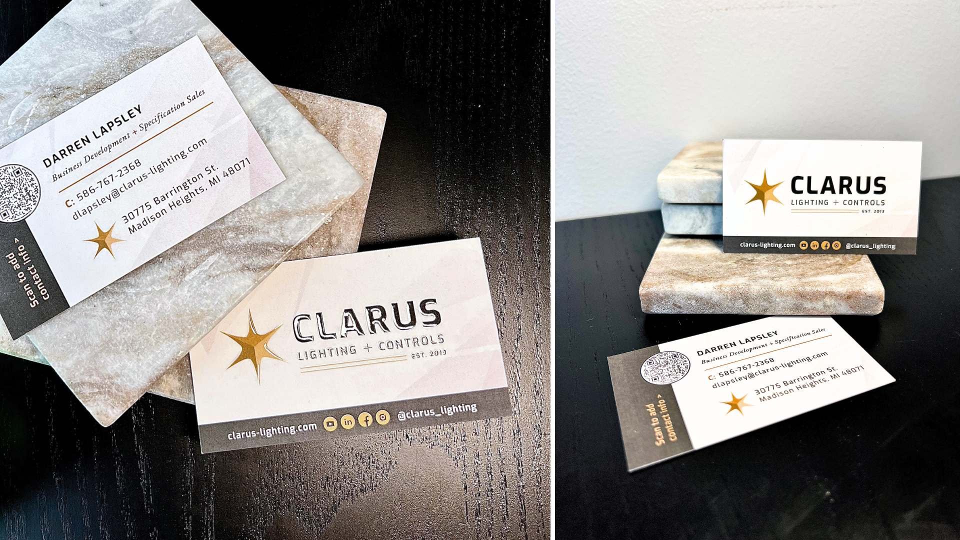
Utilize the six-pointed star for how many founding partners there are.
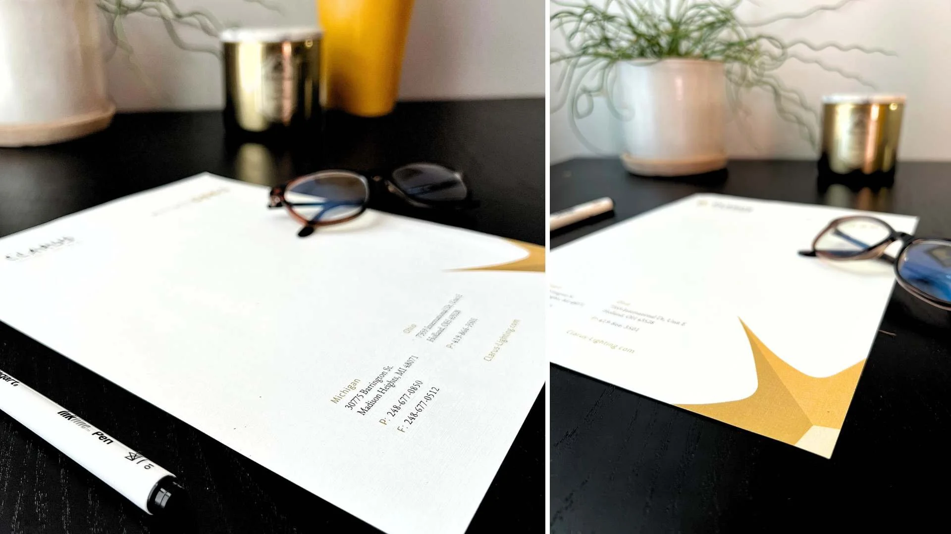
Continue to use yellow tones to reinforce a warm and inviting company culture.
Increase readability when the logo is small, especially with “lighting & controls”.

Warmth in Personality
It’s time for the employees to shine with headshots that show their professionalism and personality. We used these photos on Clarus’s website, their social channels, and their employee’s personal LinkedIn profiles.


Photos by Robert Bruce Photography